BRAND REFRESH
Elevating RadioDNS’s Digital Experience
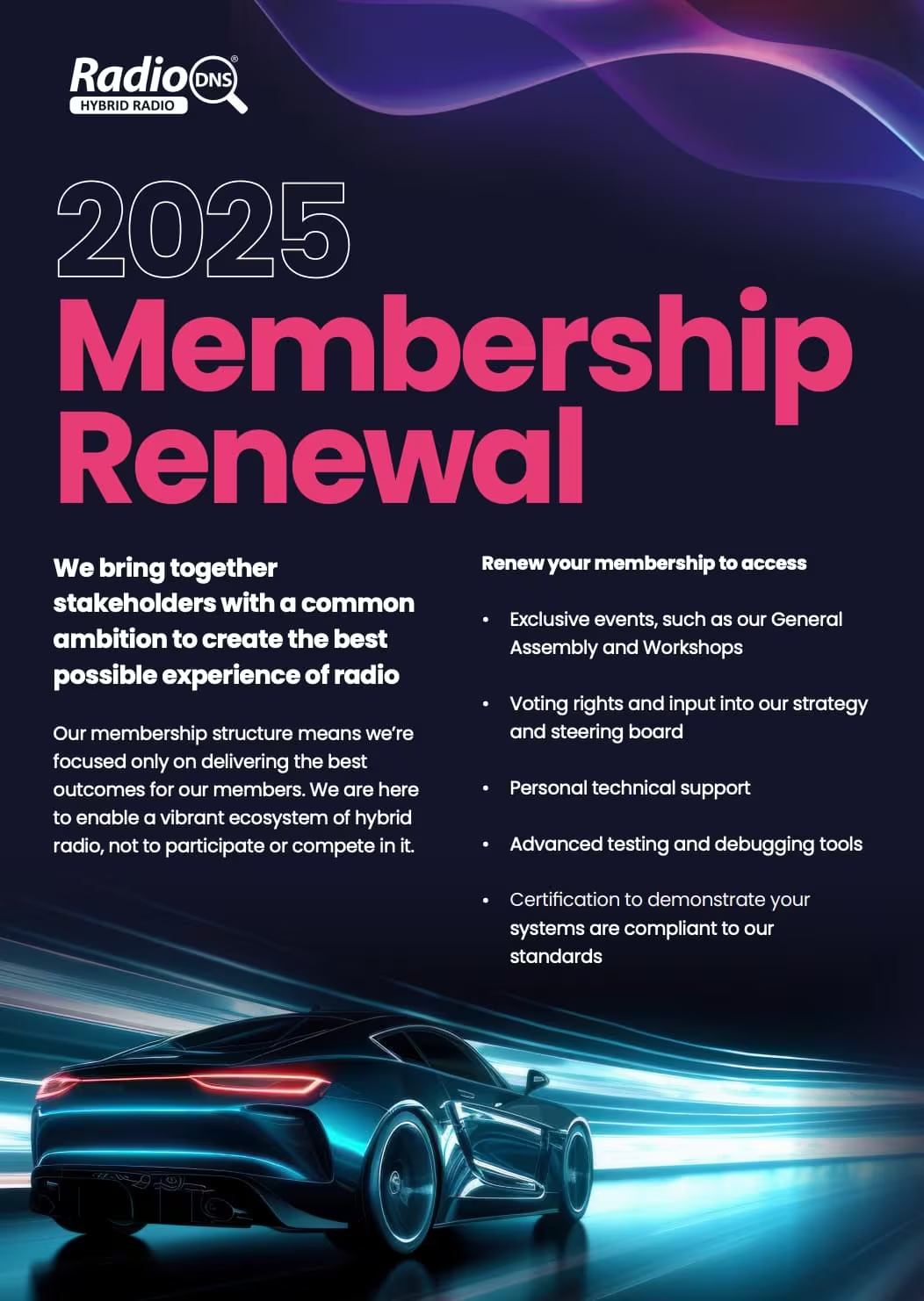
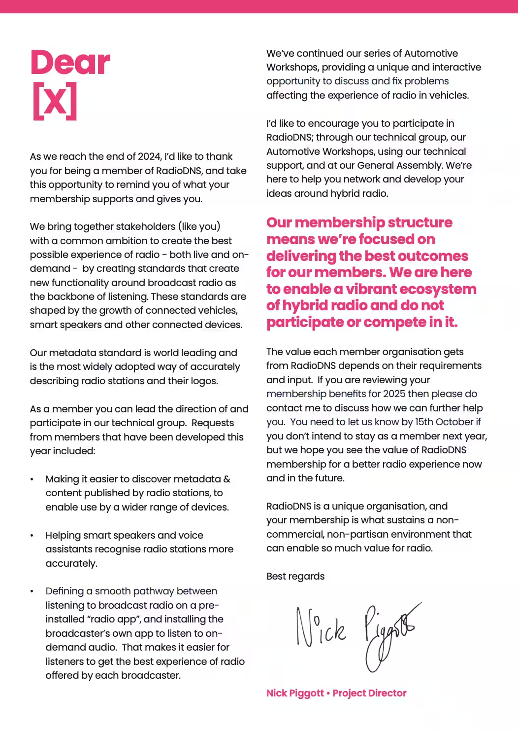
When Nick and Rosie approached me, RadioDNS’s visual identity had solid bones but needed a refresh to better reflect its position in audio and automotive tech. The goal? Make the brand feel fresh, functional, and as smart as the people behind it.
DRAG TO COMPARE
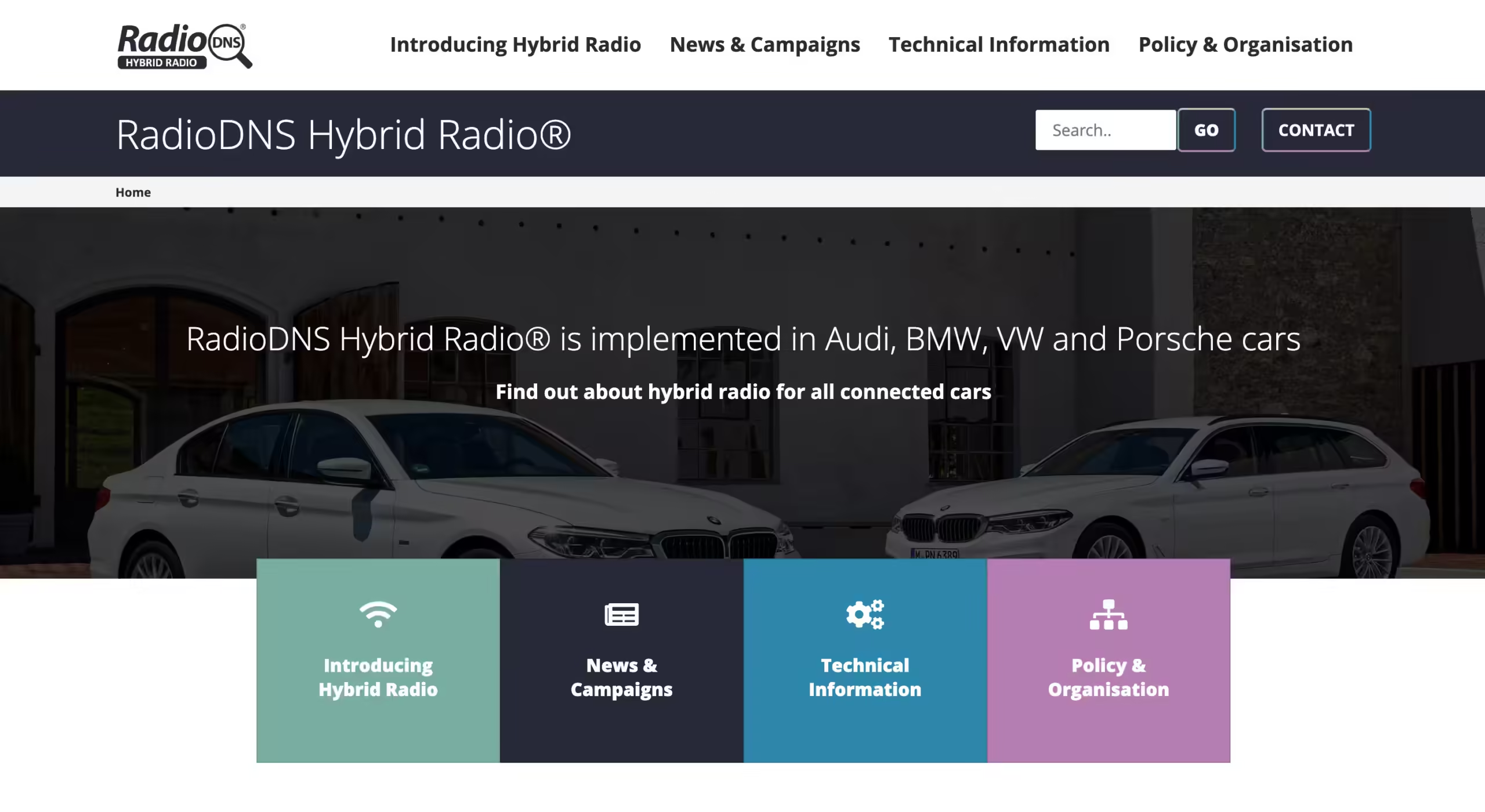
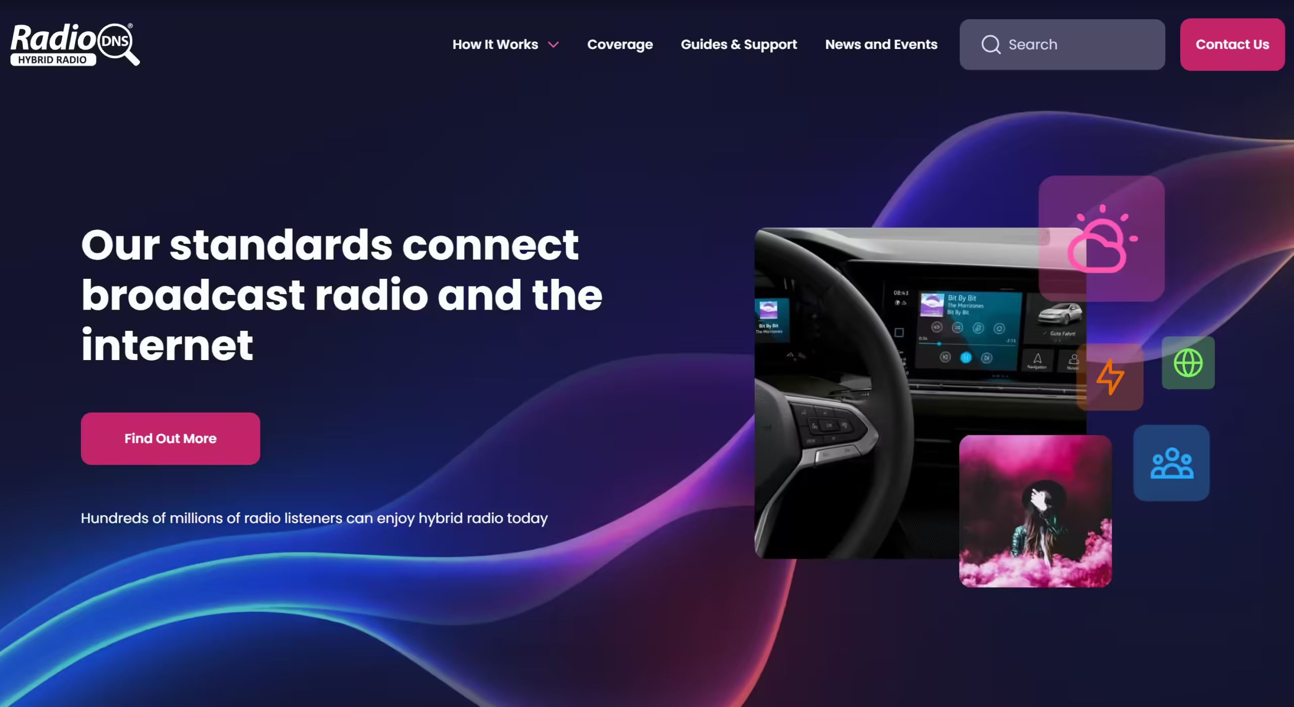
01. Streamlined User Journeys
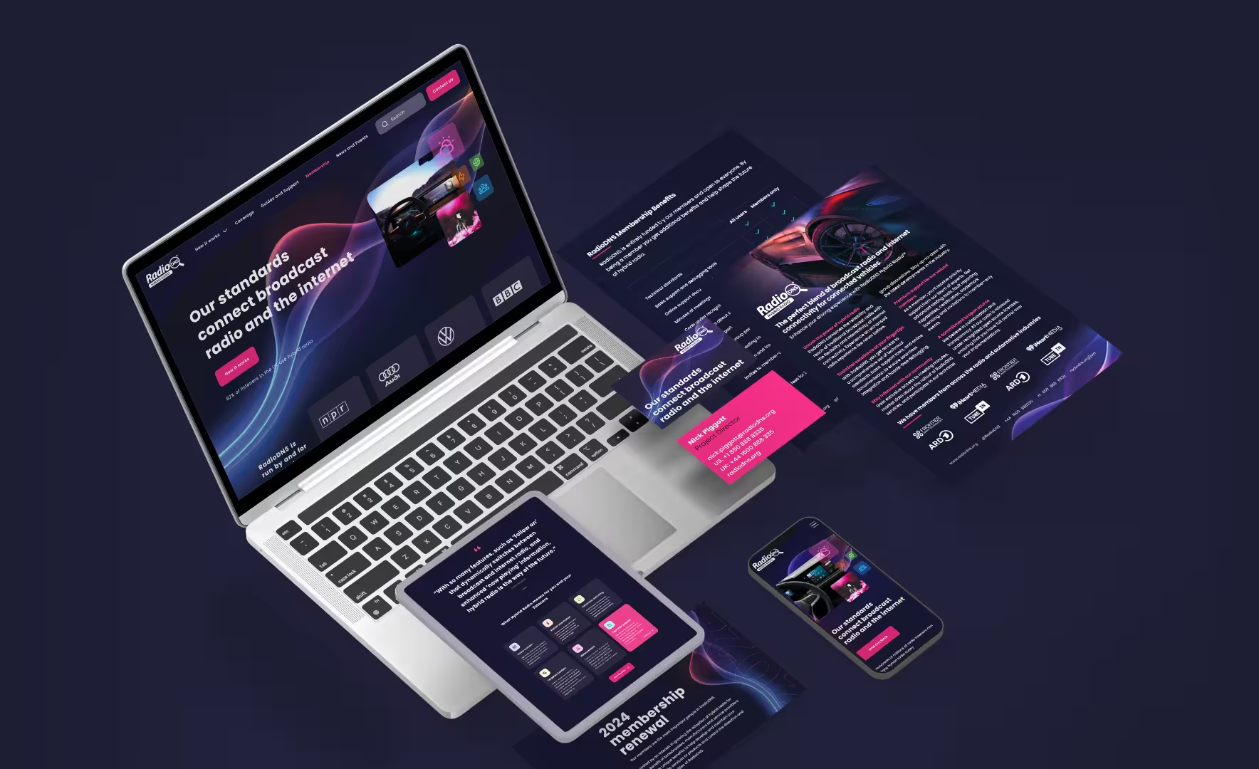
UX upgrades were key. I added a navigation bar with search and sign-in options to help users get straight to what they need. We also reworked the footer and started building dedicated landing pages for a smoother, more intuitive experience.

02. Developed the Dark Mode Theme
We built on their existing colours by introducing a dark mode design—ideal for techies coding away in low light. The deep, rich background lets their updated palette shine, with a bold fuchsia pink that’s eye-catching, accessible, and totally unforgettable in the tech world.

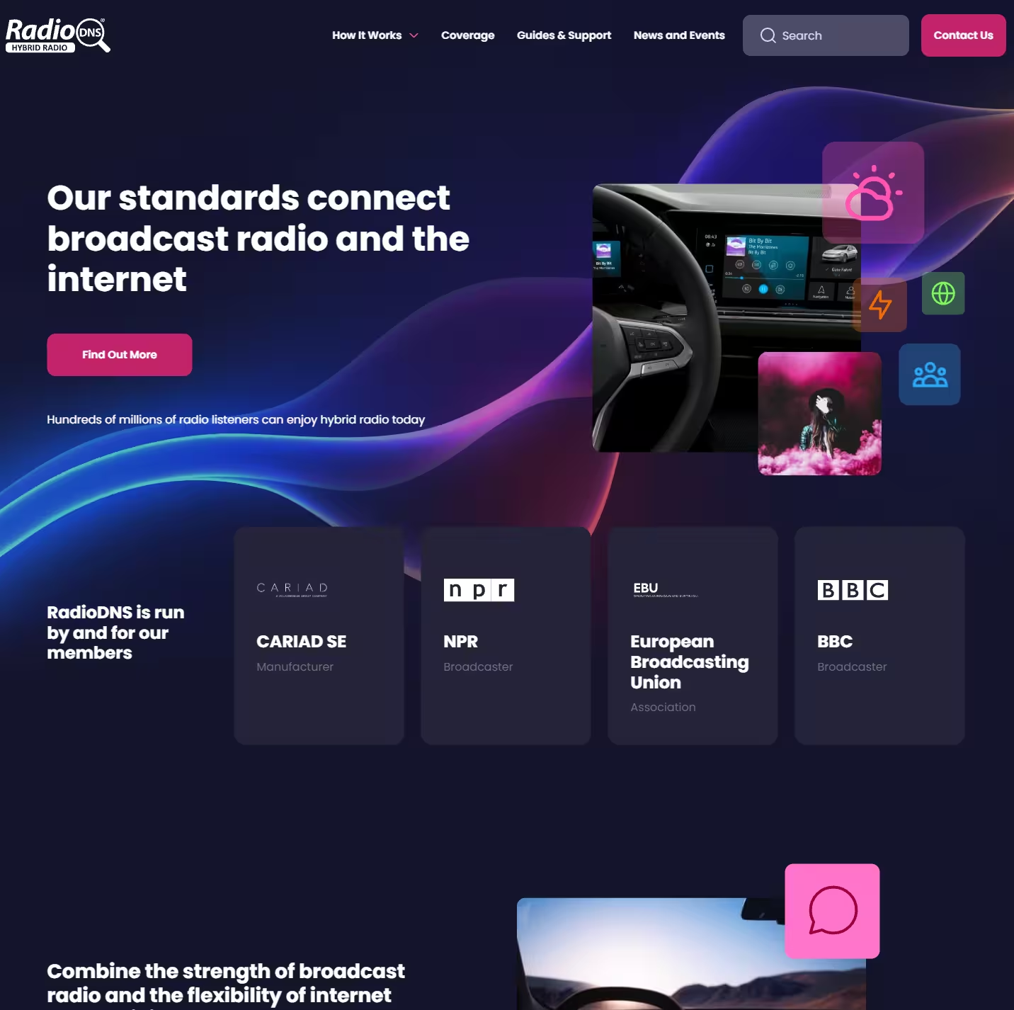
03. Guiding Users with Icons
With a palette like that, the icons had to match. I created custom icons that guide users effortlessly while looking right at home in the tech space. They’re functional signposts, but honestly, they’re just plain gorgeous too.
03. Introduced typography That Works Everywhere
The original typography wasn’t cutting it, so we introduced Poppins. It’s clean, legible, and works beautifully across platforms while being easy for the team to use without fuss.
"The engagement with our thinking, exploration of the visual elements, and creating the manifestations of our new brand - physical and online was beyond expectations."
NICK PIGGOTT • RADIODNS
6 WEEK BRAND REFRESH
Want to achieve something similar?
Stop wasting time and money on design mistakes, let’s create user-centric solutions that build trust and let you concentrate on growing your business.
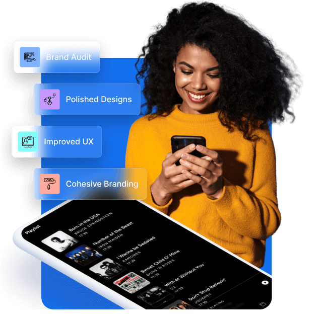
Brand Audit
We’ll dive into your current design, spotlighting strengths and identifying gaps.
Design Sprint
Transformative, comprehensive, and efficient — a 6-week journey to a polished, high-converting user experience.
Tailored Solutions:
From design systems to engaging interfaces, every detail is crafted to suit your brand.
Get started with this sprint and enjoy the confidence of a fully aligned, user-ready brand identity or service.
WORK WITH ME!
I’d love to partner with you to create a design that truly resonates and works hard for your business.
✅ Do: Embrace a centralised, cohesive identity, user-friendly design, and goal-focused decisions.
❌ Don’t: Settle for fragmented assets or neglect the user’s journey through your brand.
Let’s build a brand experience that’s true to your vision — and brings measurable results.
